

Branding and Marketing
-
Digital Marketing Designer
Timeline: 07/2021 – 12/2021
Tools: Photoshop, Illustrator, InDesign, Premiere Pro, WordPress
-
Create visual design that reflects the brand values of a nonprofit software company by utilizing existing brand guidelines.
-
Digitally accessible promotional graphics, social media adverts, corporate collateral, logo refresh
Benetech is a nonprofit tech company with a focus on developing software for social good. They strive to provide multiple program areas and initiatives that provide software and digital learning resources to impact the lives of hundreds of thousands of people across the world. Benetech has positively impacted work in Education, Employment, and Social Inclusion fields.
As a digital marketing designer, I had the opportunity to collaborate with key business stakeholders to produce digitally accessible promotional graphics, social media adverts, and corporate collateral. The experience reinforced the significance of visual accessibility in regard to web design. A design can be visually appealing to a user, but without clarity and hierarchy, the message within the design can be lost.
Intro
One of the first campaigns I worked on with Benetech was their Back to School initiative where they would advertise Bookshare Reader, an eBook reading tool designed specifically for individuals with print disabilities.
I was tasked with creating a hero graphic conveying themes such as learning and exploration, while reiterating the message of getting kids excited to go back to school. Immediately what came to my mind was a rocket ship flying through space, the captivating essence of space travel mixed with innovative technology made me think it was a perfect fit, and stakeholders agreed.
Below are 3 initial sketches that were meant to determine composition and layout of text. The tagline “Launch into Learning” was provided by stakeholders and was an effective message paired with the imagery of a rocket ship.
Back to School Campaign
First Iterations
Refining the Concept
Final Graphic
With 3 different directions presented, stakeholders and I were in agreement that the third concept with the rocket ship taking on the shape of a pencil would be the best way to present our message. Some further iterations were sketched up(below) and the second concept was then refined to create the final graphic.
After finalizing the text placement, adding some color, and further details like passengers and flames coming out of the back, the hero graphic was ready to launch. One thing I had to keep in mind of throughout this project was the importance of symbols and how they can communicate a message. Stakeholders needed a more simple illustration that can be shared in multiple instances and sizes.
Another initiative I took up during my time with Benetech was the refresh of the Bookshare Reader logo. The original design conveyed the concept of a book being flipped through, page by page, however there were issues with legibility at different scales as well as imbalance in the composition. Stakeholders needed a refreshed take on the existing logo because it wasn’t holding up well in smaller scale, with many colored pages it was visually confusing.
I was able to simplify the mark by simply reducing the number of pages, and corrected the positioning of the logo type relative to the mark. With the updated design, Bookshare users will still find the mark recognizable and familiar, just as intended.
Bookshare Reader Logo Refresh
Old Design
Before reaching the final design, there were many rounds of iteration, and with my own personal preferences clashing with stakeholders, I had to learn to compromise and think more from the organization’s perspective.
When I had set out on this project, I wanted to make large scale changes to the logo, while still retaining the educational, learning aspect. In the following sketches and concept iterations I explored different directions for a possible logo redesign, but in the end stakeholders were looking for a much more nuanced refresh.
New Design

Concepts that Never Made it
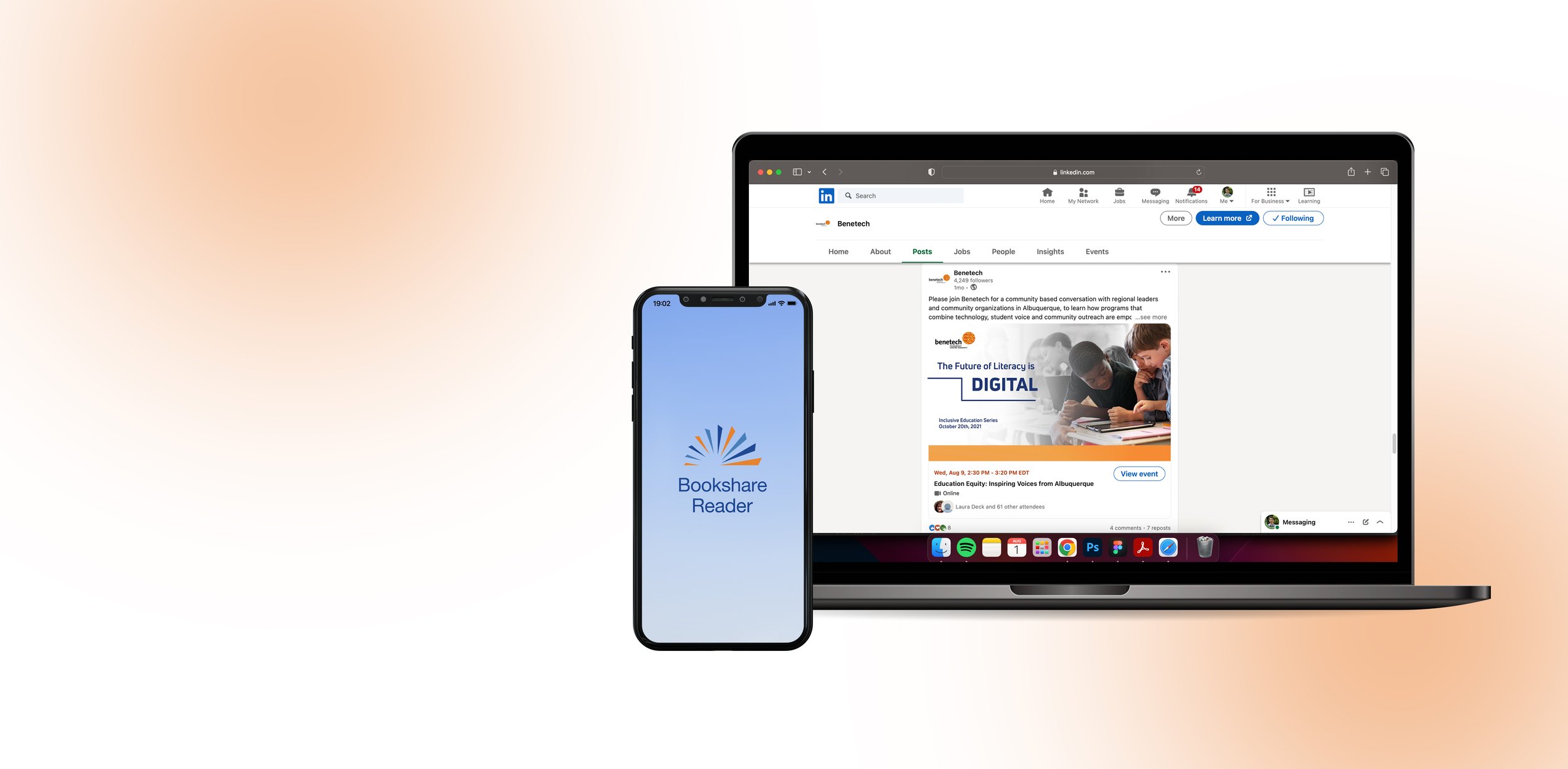
Inclusive Education Series – Event Banners
Mainly used photography and text with minimal graphic elements and techniques to ensure complete digital accessibility. These single image banners shipped as ads on platforms like LinkedIn and Facebook, and yielded the highest impact along with lowest cost.
More Graphics and Collateral Pieces


